Atelier
ATELIER is a peer-to-peer fashion marketplace and creative community where users can buy and sell fashion materials, showcase their designs, and connect with others. The app features tips, tutorials, and collaborative spaces, making it a go-to hub for fashion enthusiasts to learn, create, and thrive together.
overview
Role : UX designer
Tools: Figma, Figjam
Duration : UX 2 weeks, UI 2 weeks
Challenge
The challenge was to craft an MVP for a community-driven, peer-to-peer marketplace focused on buying and selling fashion materials, while simultaneously building a visual brand identity for the platform. The key goal was to create an intuitive, engaging, and user-centric experience that allows users to easily browse, list, and buy fashion items within the community. Ensuring a seamless balance between simplicity and detailed functionality was crucial in delivering a platform that fosters trust and interaction among its users.
Defining the problem
Some time ago, a friend of mine, who is pursuing a degree in fashion design at university, confided in me about the difficulties she faced in sourcing affordable materials for her creations. Her experience highlighted the importance of this issue, which in turn sparked my interest and motivated me to explore it further.
To gain a deeper understanding of the challenges and needs faced by individuals seeking affordable materials, I decided to conduct a user survey.
My primary focus in the survey was to explore the difficulties users encounter when sourcing affordable materials for fashion design, as well as their experiences with community-driven platforms. We asked participants about their current methods for obtaining materials, the obstacles they face, and how their approaches have evolved over time. While I received valuable insights into these areas, one unexpected finding was the extent to which users value connections and shared resources within their creative communities. This insight highlights the potential for our app to facilitate stronger, more collaborative networks among users.
Age 18-24
Annual income less than 20 000
100% of people answer high cost as their biggest challenge to buy materials
Meet Ana !
Ana Sanchez is a 20 years old Student at a fashion design university in London, United Kingdom.
She moved from a different country to study fashion design in the UK.
Ana finds its really difficult to source materials at a low cost. She is always on the lookout for affordable materials when she goes to the store.
Ana also has some difficulties learning because her ADHD she tends to lose focus and falls behinds in her course, she would love to find a way where she could study at home with some simple courses.
Pain Points
Struggles with finding affordable materials as a student with a limited budget.
Difficulty focusing in class due to her ADHD, leading to falling behind in her coursework.
Challenges in balancing her creative aspirations with the financial constraints of being a student.
Lack of a supportive learning environment that accommodates her unique learning needs.
Needs
Access to affordable materials for creating garments.
Opportunities to learn new techniques and improve her fashion design skills.
Ways to connect and network with people in the fashion industry.
Flexible learning options that allow her to study at home.
Ana’s Journey
competitor analysis
All major fashion platforms miss the mark on integrating collaboration tools and community support. While they offer marketplaces and various features, they lack interactive forums, educational content, and easy ways for users and creators to work together. This creates an opportunity to build a platform that combines transactions with robust community engagement and collaboration features
IDEATION
I use the Crazy 8 method, a rapid brainstorming technique that involves sketching eight different ideas in just eight minutes. This approach pushes me to think creatively and explore a wide range of possibilities quickly for this MVP.
User Flow
I decided to create a happy path to streamline and visualize the ideal user journey, focusing on a seamless experience for Ana as she navigates through a peer-to-peer marketplace platform. This process highlights the steps she takes to browse, select, and purchase fabric from other users, ensuring a positive interaction from start to finish. By mapping out the happy path, I aim to identify and optimize key actions and touchpoints, minimizing friction and enhancing user satisfaction. This clear flow helps in understanding the most efficient way for Ana to accomplish her goals, leading to a successful transaction between peers.
Information Architecture
After mapping out the happy path, I decided to create an information architecture. The happy path clarified the ideal user journey for someone buying an Fashion material, but a well-organised structure is essential for intuitive navigation. Based on a user survey, where 30.8% emphasised the importance of community, I added a community button on the home page leasing to the community page. Additionally, since user-generated content (blogs, videos, tutorials), forums, and group discussions came number one in my survey, I included those features. With 80% of users expressing interest in selling their own designs within the app, I integrated a designer creation section on the homepage and the option to browse and filter.
Wireframes
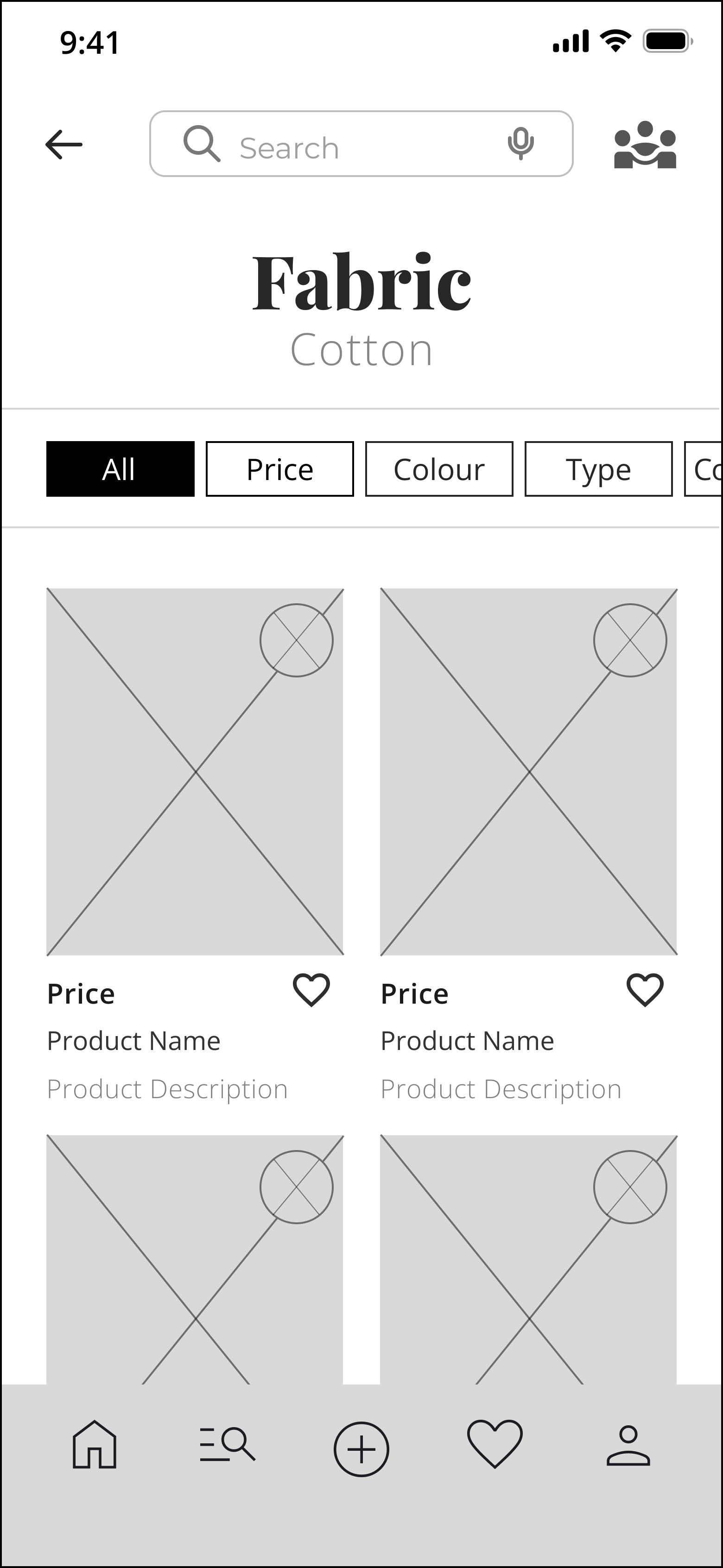
decided to create a mid-fidelity wireframe to focus on the layout and functionality of the marketplace platform. This approach allows me to clearly define the user flow and core features, ensuring that the design is intuitive and practical. By concentrating on structure and interactions without being distracted by detailed visuals, I can refine the user experience and make necessary adjustments before progressing to more polished designs.
TESTING AND ITERATION
After
Before
In this design iteration, I enhanced the filter functionality to improve usability and consistency. The original filter options, which were presented as separate buttons, have been replaced with a streamlined horizontal filter bar. This bar includes an "All" button, allowing users to quickly view all items without manually selecting individual filters.
These changes simplify the filtering process, making it more intuitive and aligned with the design patterns used elsewhere in the app. The result is a cleaner, more cohesive interface that enhances the overall user experience.
In this update to the Community home page, I focused on enhancing user engagement by adding "Visit profile" buttons beneath the "Designers of the Month" section, allowing users to easily access the profiles of featured designers. This change, in addition to the consistent filter options implemented earlier in the products section, creates a more streamlined and user-friendly experience across the platform.
I redesigned the "My Materials" page to enhance usability and readability. The original grid layout was replaced with a more streamlined list view, allowing users to easily scan and manage their materials. Important details such as the material name, completion date, and price are now displayed more prominently, improving the information hierarchy. This update not only aligns with the app's overall design language but also provides a cleaner and more consistent user experience, making it easier for users to navigate and find what they need quickly.
Moodboard
Inspired by a visual moodboard featuring vibrant colours and high-fashion imagery, I designed the UI with bold, modern, and artistic brand attributes. The initial design concepts received positive feedback, confirming the design direction.
The product page features a minimalist layout with neutral colours, allowing product images and key details like price and reviews to stand out. Subtle accents of coral and yellow add elegance without overwhelming the design, keeping the focus on product details and enhancing the shopping experience.
In contrast, the community page is vibrant and playful, using bold coral and yellow tones to create an energetic feel. Key sections like "Designers of the Month" and "Tutorials" are neatly organised, with intuitive navigation and engaging visuals that encourage user interaction.
Overall, the design balances modern sophistication with bold creativity, delivering a cohesive and visually dynamic user experience across the platform.
Prototype
The future of atelier
Designer profile
It will allow designers to build detailed profiles showcasing their portfolios, backgrounds, social media links, and client reviews, enhancing their visibility and engagement.
Challenge of the Month
It will spark creativity and community involvement by presenting monthly design challenges with submission portals, leaderboards, rewards, and archives of past challenges.
Sell a material
With the Tab button It will enable users to effortlessly list their own fashion materials.


